
Get to know my projects
Case Studies
Learn more about how I design and my process.

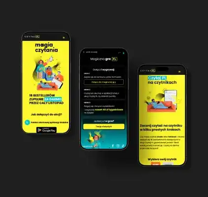
Czytaj PL
Comprehensive support for the Czytaj PL social campaign
Project details

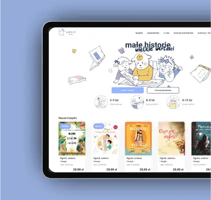
Esprit Kids
Kids publishing house website
Project details
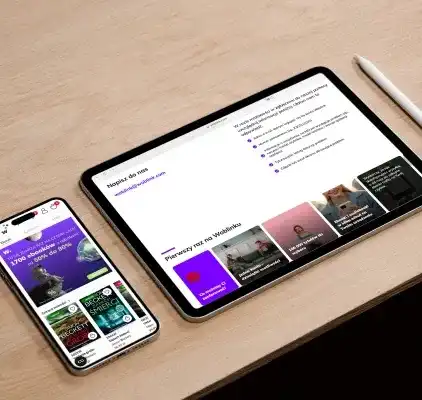
Woblink
Woblink is an online bookstore specializing in the sale of ebooks and audiobooks, which has been in business for more than 13 years. Main goals of my work focus on several areas:
Project details

Personal Trainer
Joanna Zofia is a woman who approaches her work with great passion and courage. She needed a distinctive logo and website that would allow her to showcase a wide range of her experiences and capabilities to clients. Joanna also aims to develop a blog section, and the entire project is designed to evolve alongside the growth of her business as the brand owner.
Project details

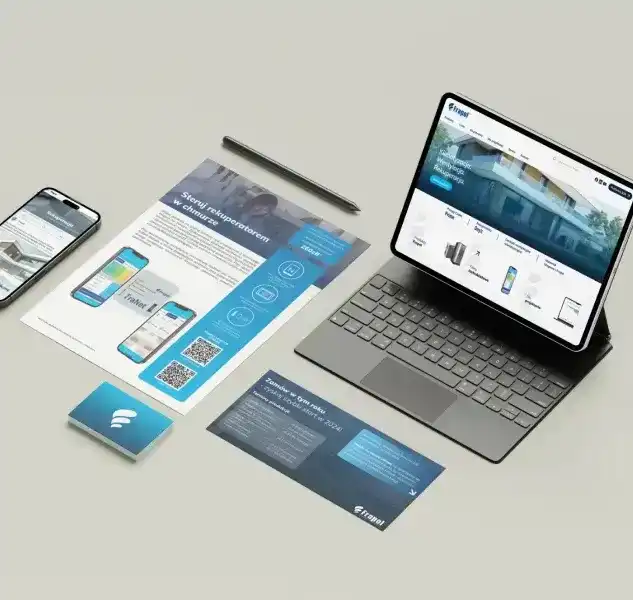
Frapol
The most important goal was to arrange and plan visual communication in the context of upcoming changes for the company. Frapol is an environmentally recognized brand with years of experience in the market. Recently, it has intensified its marketing activities by opening up also to individual customers. The refreshed identity is intended to respond to the needs of a wide range of customers and follow the trends of modern competition. The challenge was to match the large amount of printed materials already in place at the company.
Project details
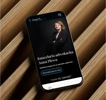
Lawyer Anna Plewa
Anna is a lawyer with extensive experience and great empathy. Her clients are usually private individuals, residents of small towns. Through her new branding and website, Anna aims to reach new clients and establish more business relationships.
Project details
Contact me!
I will be happy to answer any questions.

Follow me on social media:


